


In Gallipoli, Milan architecture firm AtelierP creates a fish restaurant which, although not overlooking the sea, evokes all its glints and iridescence with the aid of Crogiolo Lume super-glossy stoneware small brick tiles.
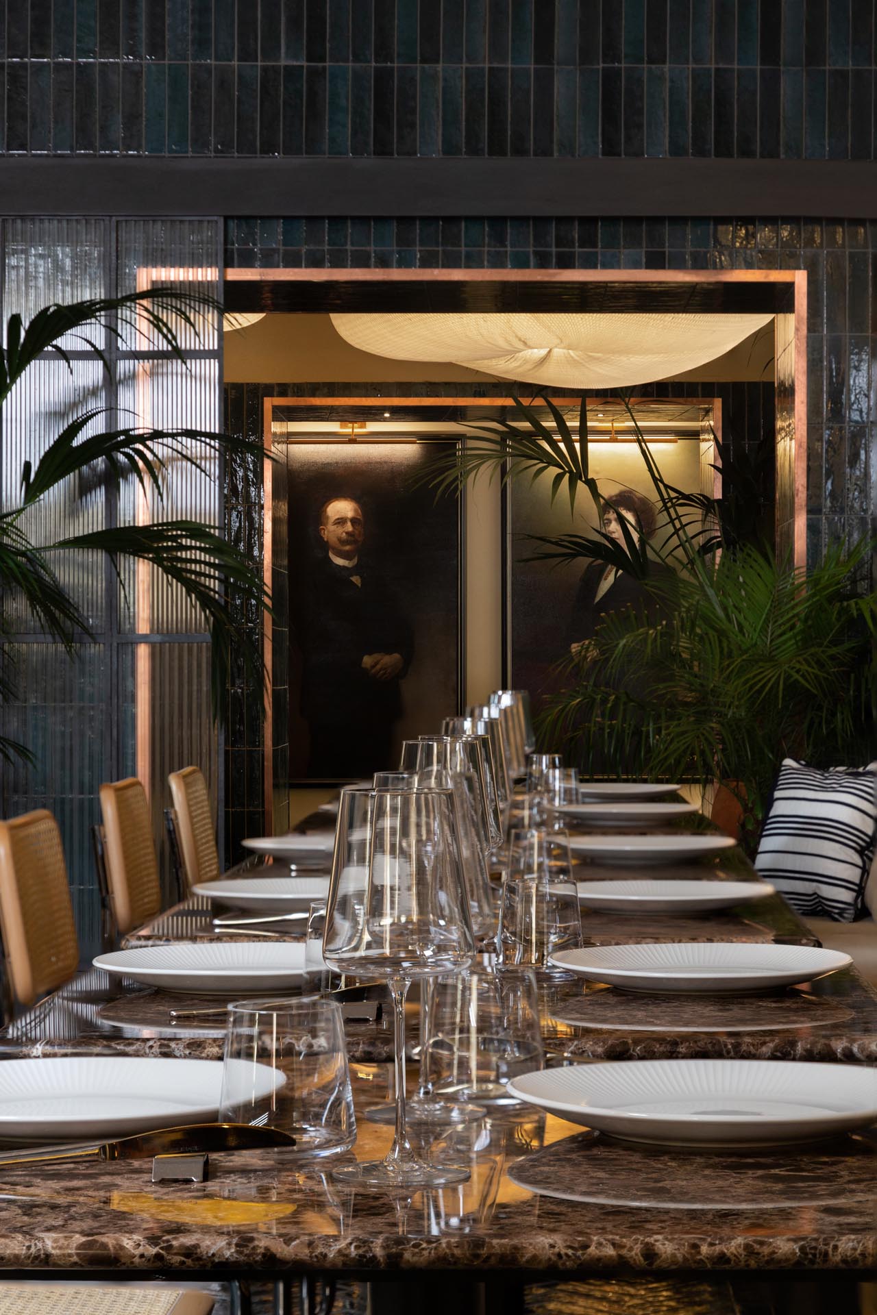
In the old centre of Gallipoli, the Lazzaro & Caterina restaurant occupies premises of about 300 m2 slightly below street level, at the foot of the historic Palazzo Presta building. Architects Luca Piccinno, Mattia Pareschi and Alessandro M. Cesario, of Milan firm AtelierP, aim to place the restaurant conceptually right on the Spiaggia della Purità beach, the town’s chief glory, with a project that evokes the colours and brightness of the sea.
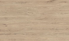
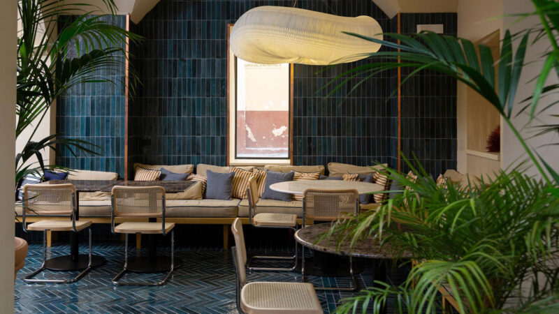
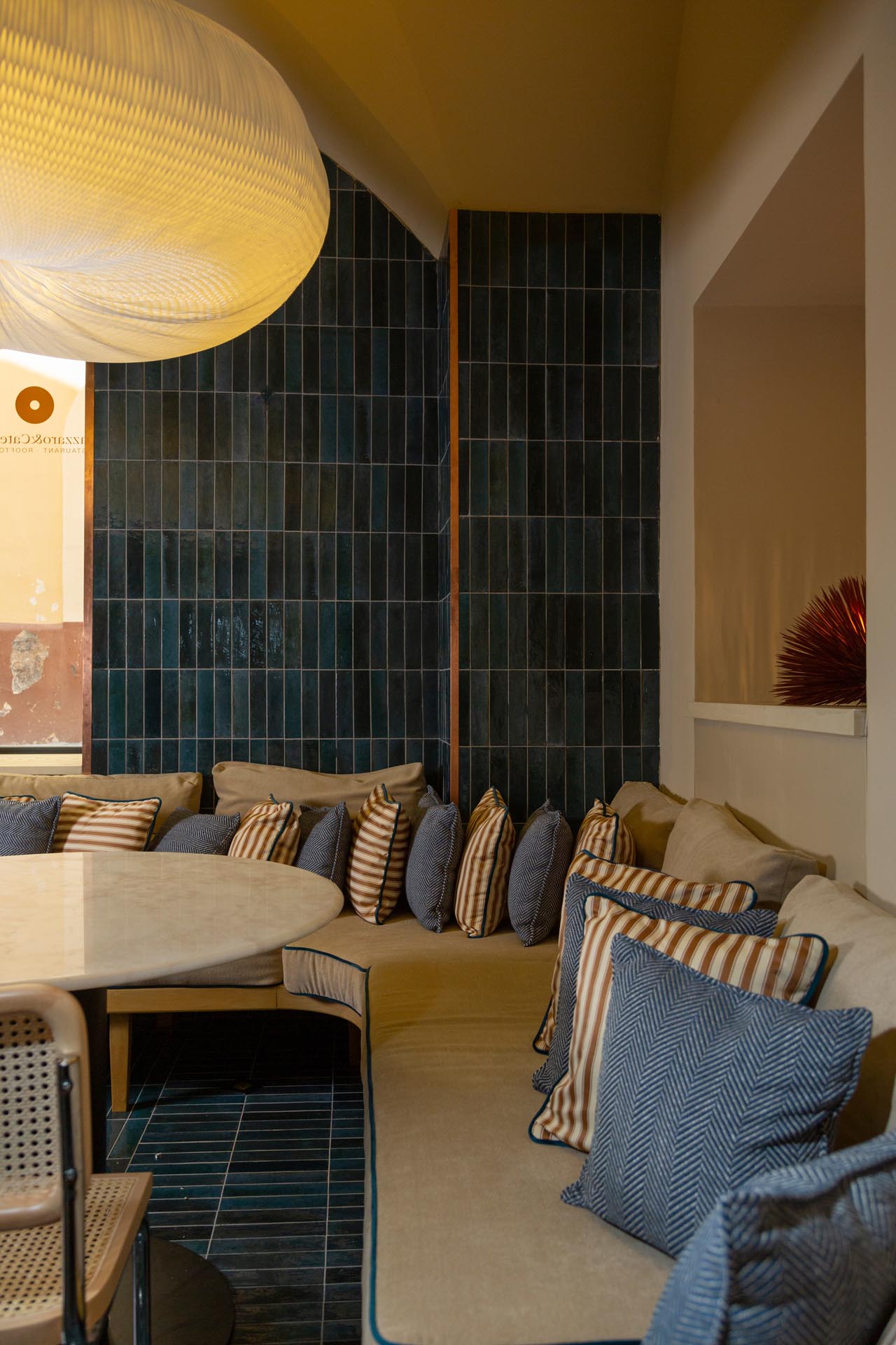
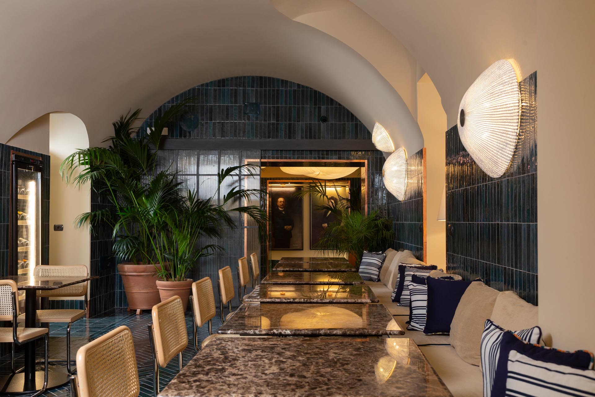
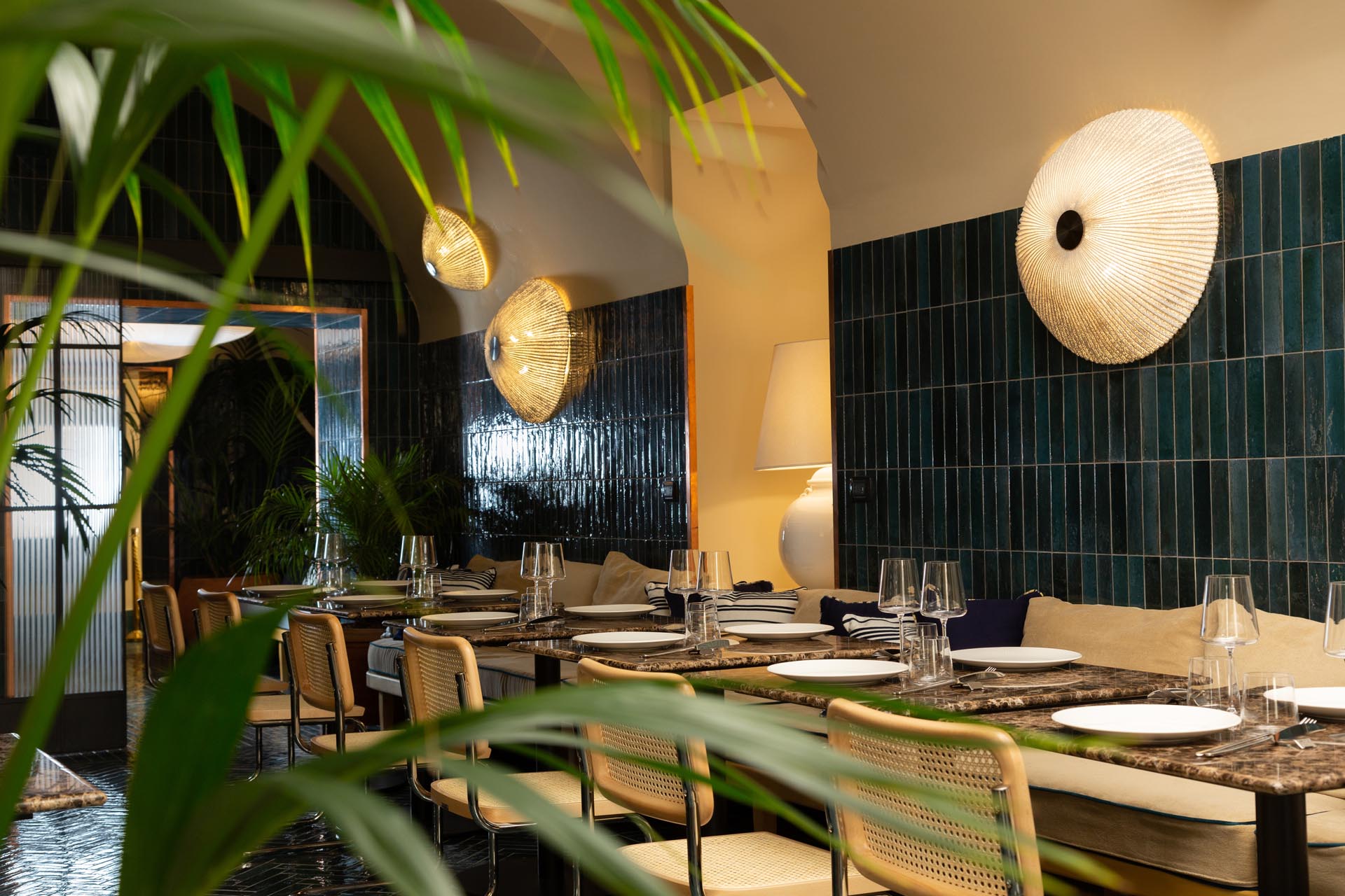
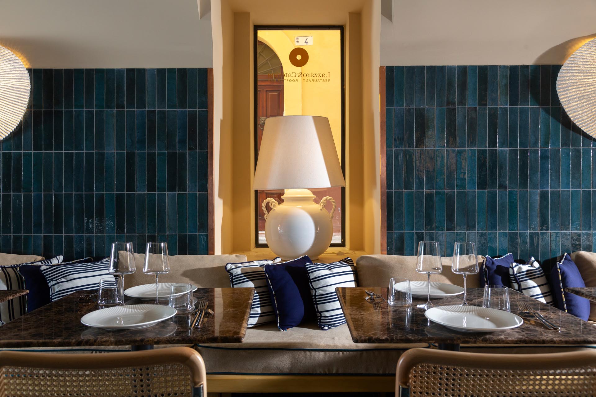
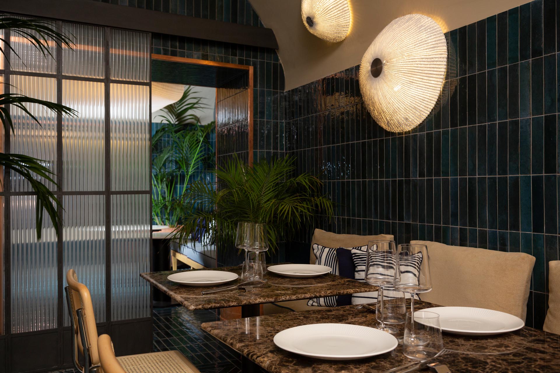
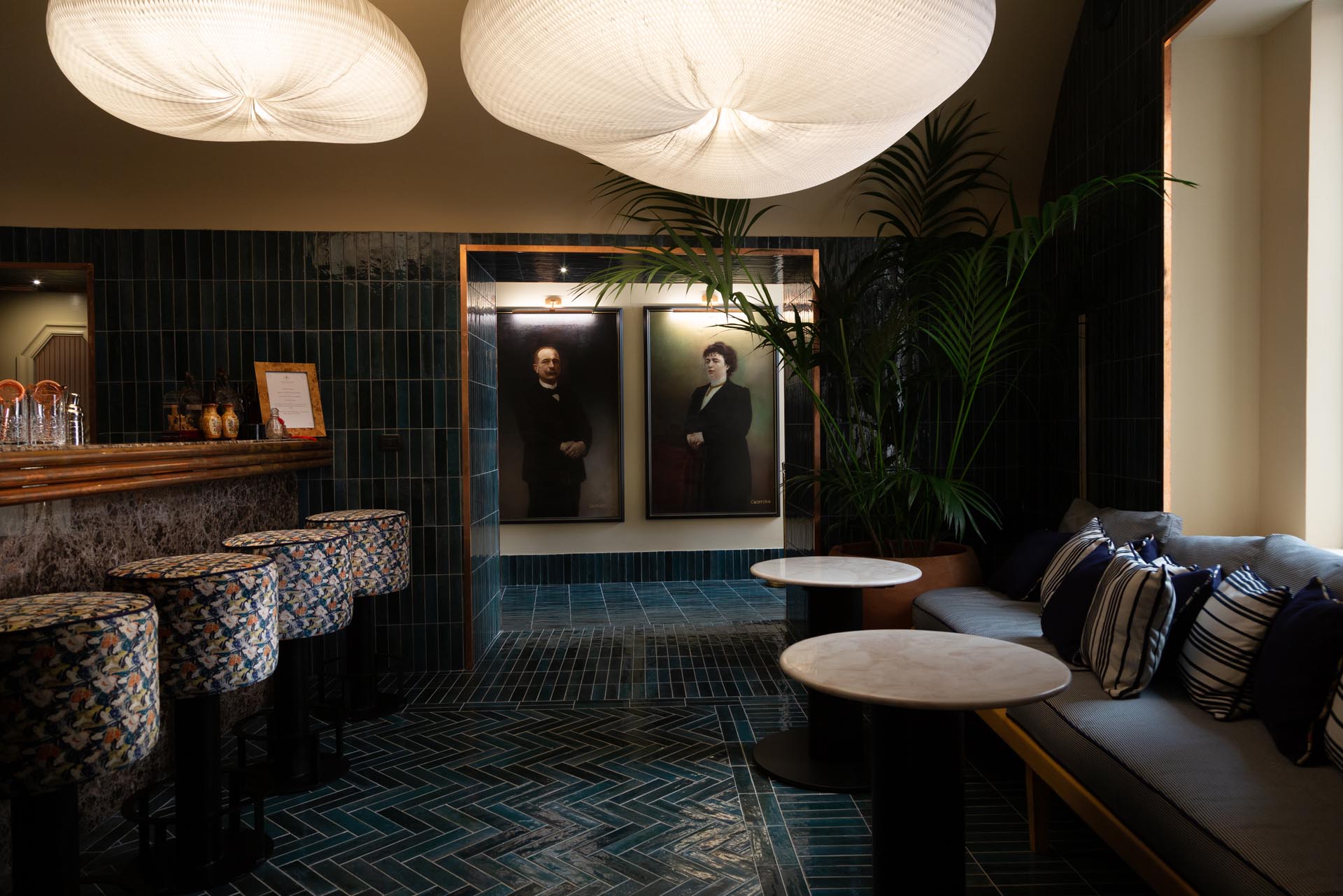
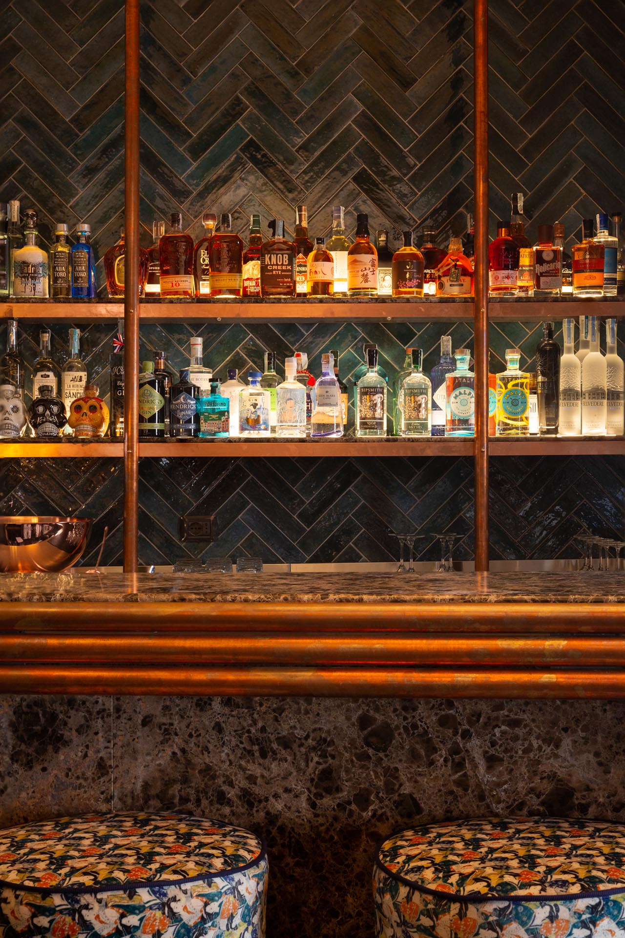
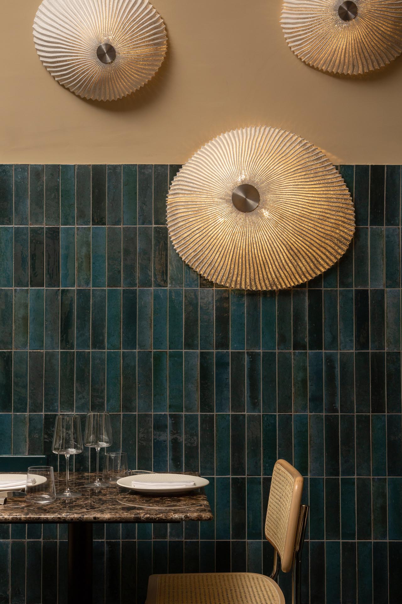
The restaurant was created by combining and renovating four apartments, with a long, narrow dining-room to which the architects brought fluidity and variation through lavish use of Crogiolo Lume tiles in Blue colour, used on both the walls and the floor. “In the floor,” explains architect Mattia Pareschi of AtelierP, “we certainly aimed for a uniform background but we also wanted subtle variations in colour, while still using the same material. To give the impression of the nearby sea, we used Crogiolo Lume iridescent brick tiles to cover the walls up to a certain height. This amplified the shade variations and highlighted the furnishings, such as the sofas or the other marble-effect surfaces.”
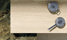
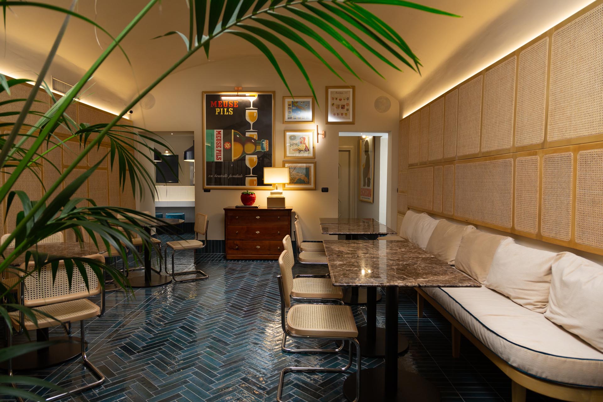
The interior design features an early C20th colonial mood, underlined by details such as an antique chest-of-drawers, Thirties posters and touches of palm-like green. An oak bench with light brown cushions runs around the walls, facing the chairs with woven cane seats and tables with beige stone-look tops: these light-coloured furnishing details contrast with the deep blue of the tiles all around. So the design scheme is based on sandy shades and colours of the depths of the sea.
The tile installation pattern is cleverly varied: “We didn’t just use the standard layout,” Mattia Pareschi points out, “but instead we switched to herringbone in the middle of the floor, creating a kind of carpet and differentiating the various areas in spite of their uniform colour. The surfaces evoke the colours of the surrounding landscape and the irregularities of hand-crafted natural materials. The tactile effect of these new ceramic materials is amazing: the shade variations generate the same impression as quarried materials, uneven and with no two pieces ever the same. With this differentiation, we can bring variety to surfaces and vibrancy to the interior. Here ceramics are not just a cladding: they provide compositional potential and play a major role in the interior design. What’s more, in the case of Crogiolo Lume ceramic tiles don’t imitate other materials but have their own recognisable, tactile identity.”
Although the restaurant is slightly below street level, natural daylight floods in through the large windows which give onto the narrow street of the old town, and is reflected in the majolica-look brick tiles to generate a constantly changing iridescence. To conclude, the marine concept is evoked by the Medusa-like wall lamps by Arturo Álvarez and the recycled paper lamps by Molo Design, which hang in the bar area like two sea-anemones.
“We’ve also used ceramic tiles in other projects in Milan,” Mattia Pareschi concludes. “They have often been marble-effect slabs because we needed a material that referenced its beauty and its luxury image, but with more stable characteristics which could be maintained over time regardless of who was caring for it. Porcelain stoneware offers these benefits together with precise, certifiable technical properties, which make it particularly suitable for meeting technical procurement specifications in the HoReCa sector.”
Ph. Fabrizio Cirfiera
Project gallery

Explore project collections